Examples
See the examples/ folder for source code.
| Image | Example |
|---|---|

|
Boing
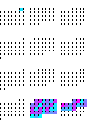
The Amiga Boing Ball, 1984, animated the way the Amiga animated it: the ball is drawn once as colour indices and spins because the palette is rewritten between frames, while the bounce moves a rigid sprite to whole-pixel positions. Two lookups, so the whole animation is one array with a time axis — built with |
|
Calendar heatmap Calendar heatmap of daily maximum temperatures in Oxford, 2025. |
|
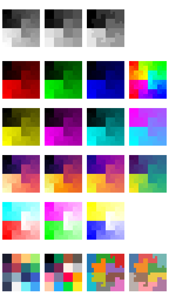
Colormaps Gallery of all available continuous and discrete colormaps. |
|
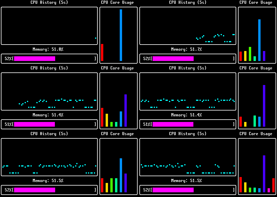
Dashboard Live system monitoring dashboard showing CPU and memory usage. |
|
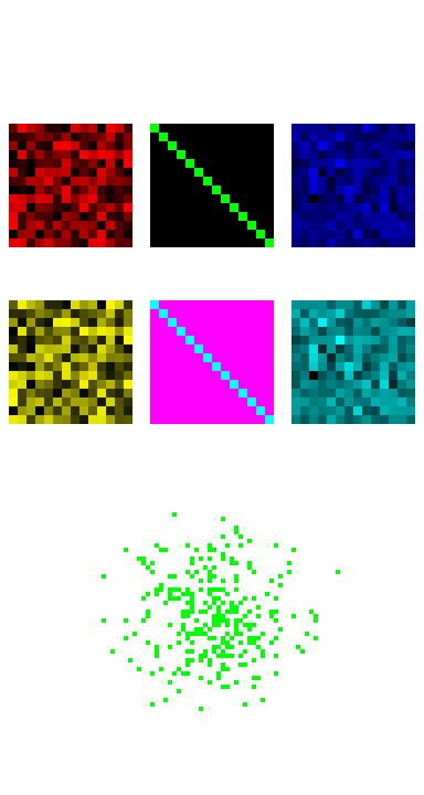
Demo General demonstration combining images, borders, and scatter plots. |
|
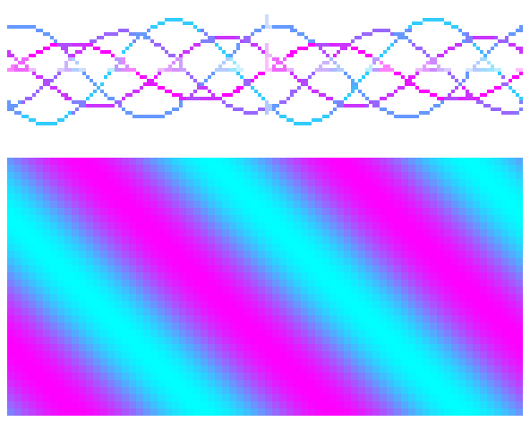
Functions Mathematical function visualisation with scatter and function2. |
|
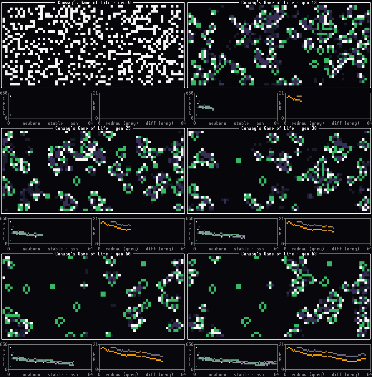
Game of Life Conway’s Game of Life, coloured by what just happened to each cell: newborn, stable, or recently dead. The panels underneath track the cell counts and, on the right, what each frame cost to write against what a full redraw would have cost — the two curves separate as the board settles, because a differential redraw costs in proportion to the cells that changed rather than the size of the board. |
|
Hilbert curve Hilbert curve visualisation of binomial data. |
|
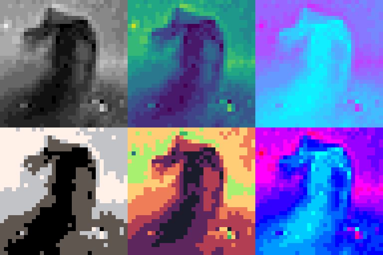
Image rendering Image rendering with various colormaps. |
|
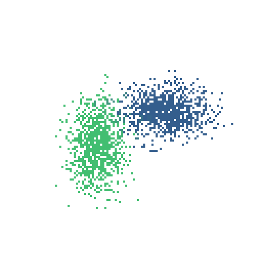
Joint distribution Joint distribution with marginal histograms, demonstrating plot composition with hstack and vstack. |
|
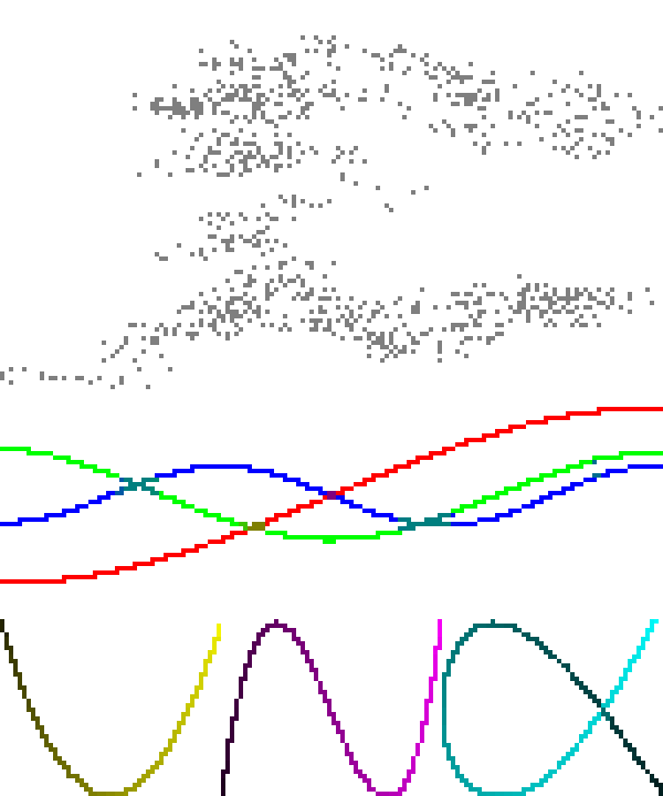
Lissajous curves Brownian motion PCA visualisation with scatterplots and plot arrangement. |

|
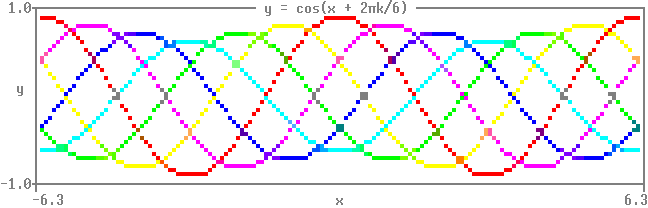
Mandelbrot Animated Mandelbrot fractal zoom using function heatmaps and colormaps. |
|
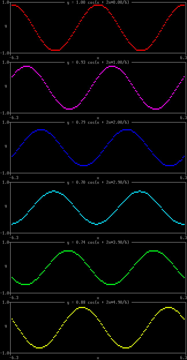
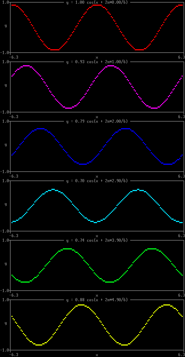
Quickstart 1 Coloured cosine waves with phase offsets. |
|
Quickstart 2
Animated cosine wave with shifting phase and amplitude, as a loop of |
|
Quickstart 3
The same animation with the loop handed to |
|
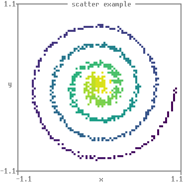
Scatter Spiral scatter plot with viridis colormap. |
|
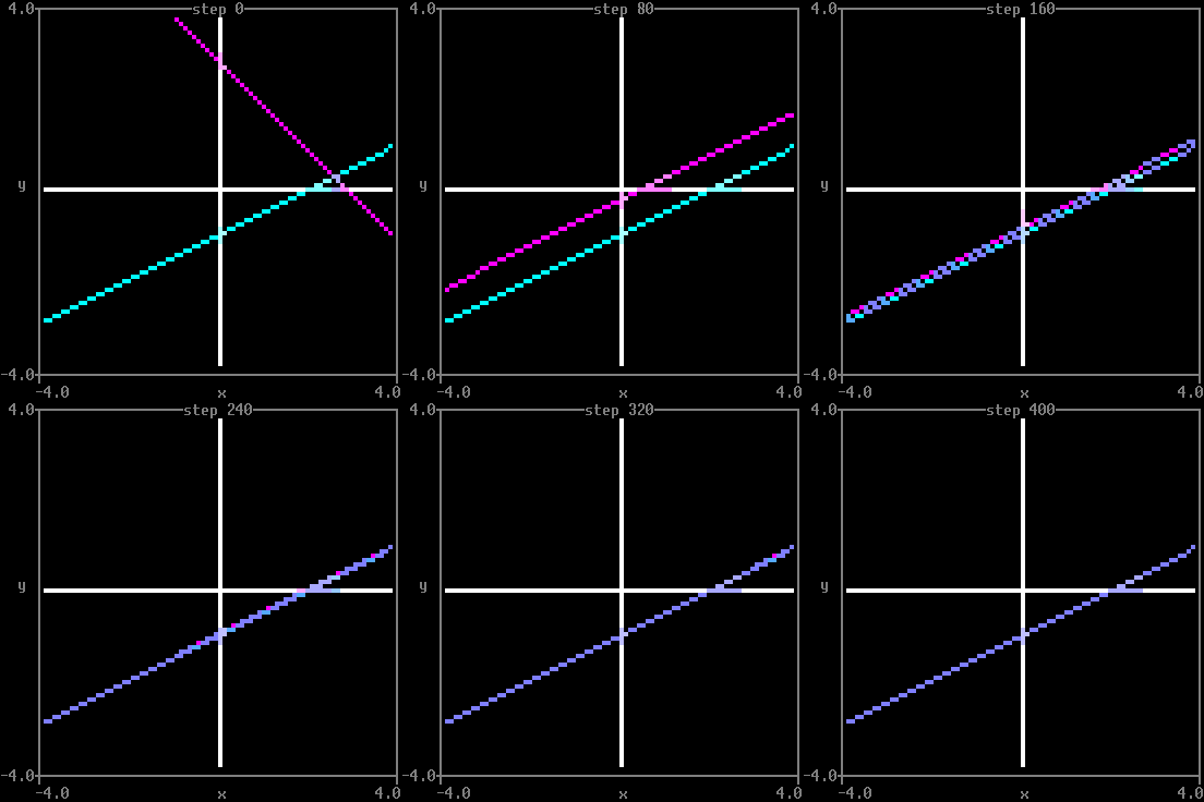
Teacher-student regression Gradient descent on a simple teacher-student linear regression model. |
|
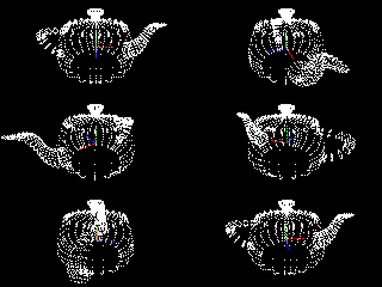
Teapot 3D scatter plot with animated camera orbit. |
| Nothing to show here: a picture of this one running on someone else’s terminal tells you nothing about yours. |
Terminal test Does your terminal render matthewplotlib correctly? Four stages — colour, redrawing in place, resizing, and a plot pushed against the right margin — exercising every escape sequence the library can emit, each saying what it should look like so you can judge it. Measures your terminal’s width and draws to it. See the compatibility page. |
|
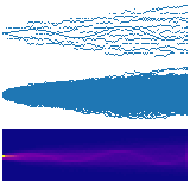
Time series histogram Time series visualisation with stacked scatter, pooled scatter, and 2D histogram. |
|
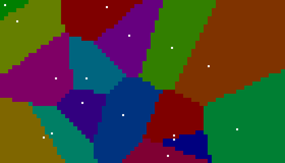
Voronoi diagram Voronoi diagram using function heatmaps and scipy. |