Examplesdocs
Do you have a cool, standalone matthewplotlib example?
I'd love to include it on this page! Please send me a link.
Contents:
- Point Data Visualisation
- Surface Data Visualisation
- Nonlinear Visualisation
- Bars and Columns
- Boxes and Candles
- Media
- Maps
- Retro Animations
- Simulations
- Dashboards and UI
- Utilities
See the examples/ folder for source code.
Point Data Visualisationdocs
| Image | Example |
|---|---|
|
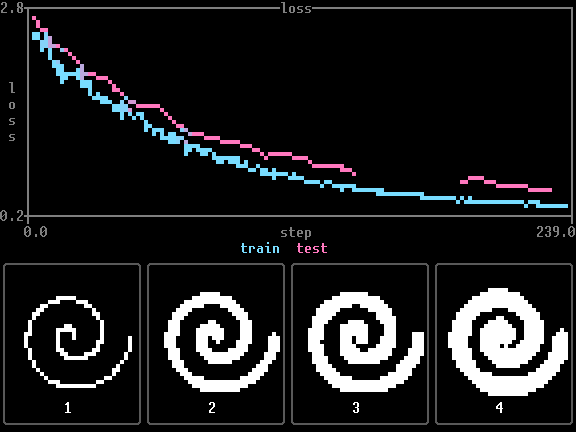
Line charts Line plot test, including series with missing values (NaN). By Claude Opus 5. |
|
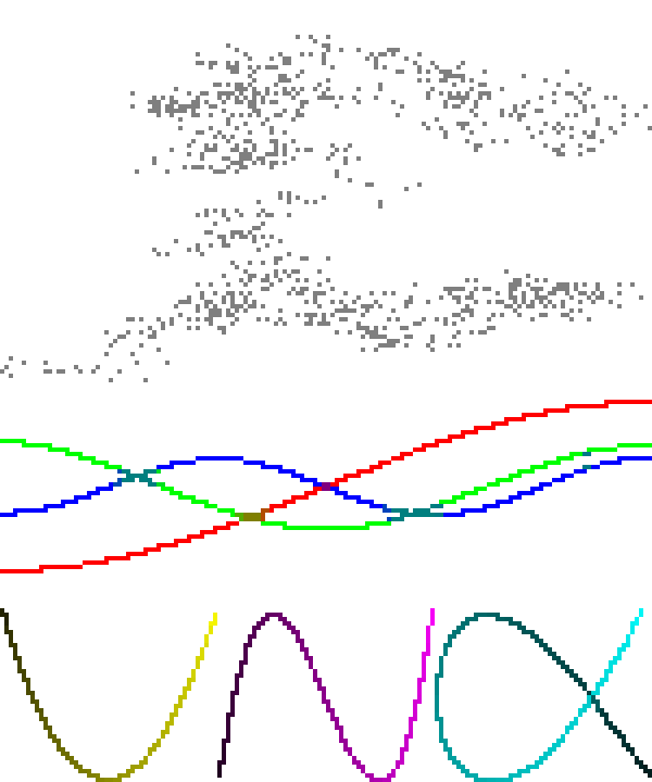
Lissajous curves Brownian motion PCA visualisation with scatterplots and plot arrangement. By Matthew Farrugia-Roberts. |
|
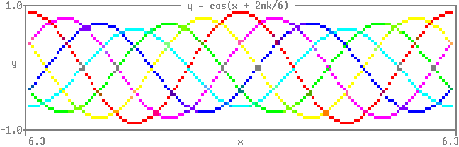
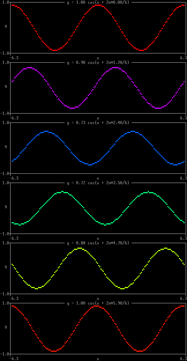
Quickstart 1 Coloured cosine waves with phase offsets. By Matthew Farrugia-Roberts. |
|
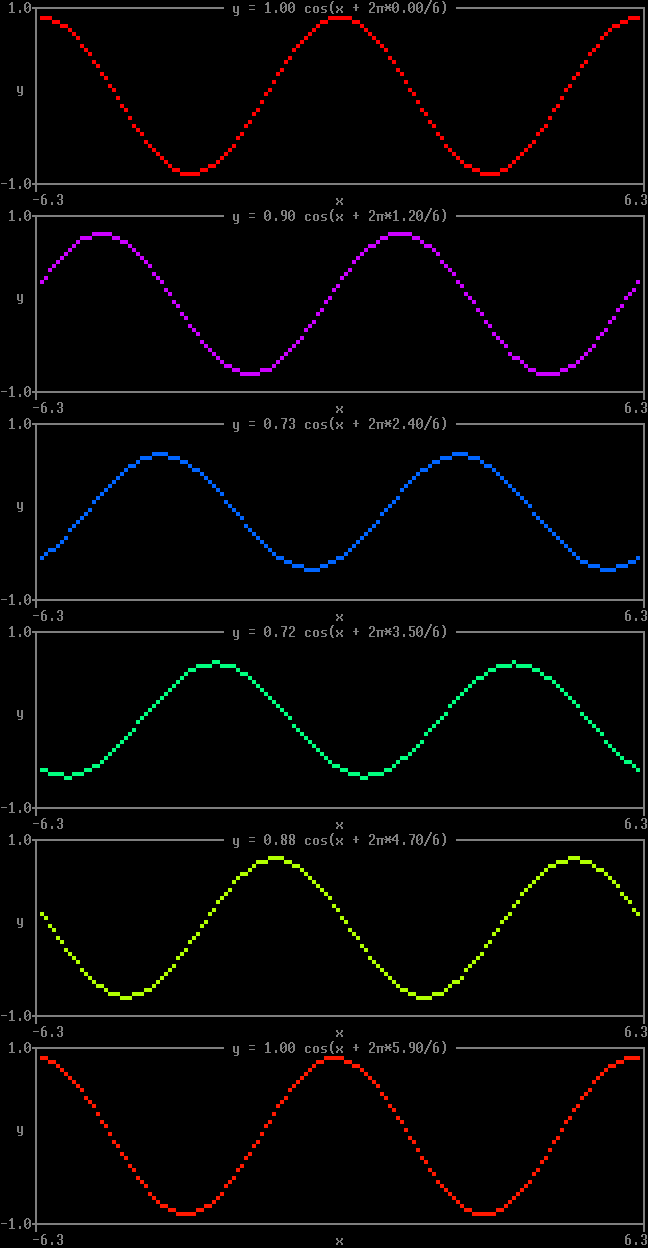
Quickstart 2 Animated cosine wave with shifting phase and amplitude, as a loop of
By Matthew Farrugia-Roberts. |
|
Quickstart 3 The same animation with the loop handed to By Claude Opus 5. |
|
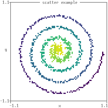
Scatter Spiral scatter plot with viridis colormap. By Matthew Farrugia-Roberts. |
|
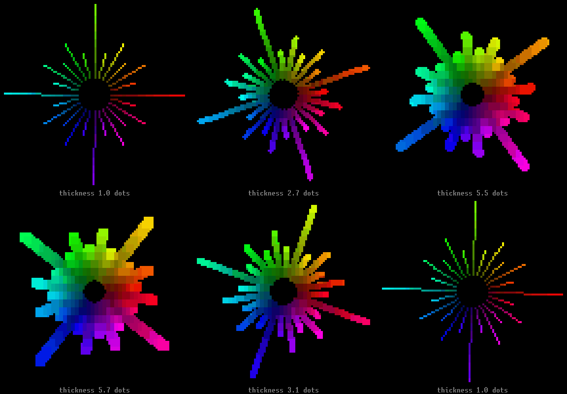
Starburst Line plot colour and thickness test. By Claude Opus 5. |
|
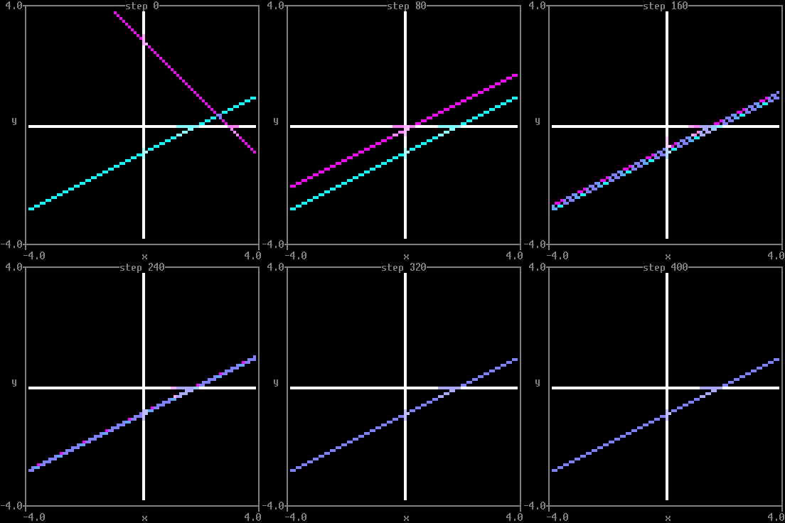
Teacher-student regression Gradient descent on a simple teacher-student linear regression model. By Matthew Farrugia-Roberts. |
Surface Data Visualisationdocs
| Image | Example |
|---|---|
|
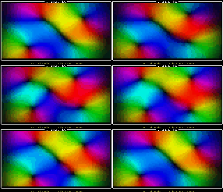
Chromatic flow A moving incompressible velocity field, with hue showing direction and brightness showing speed. Its custom colormap consumes two-component vectors directly. By GPT 5.6 Sol. |
|
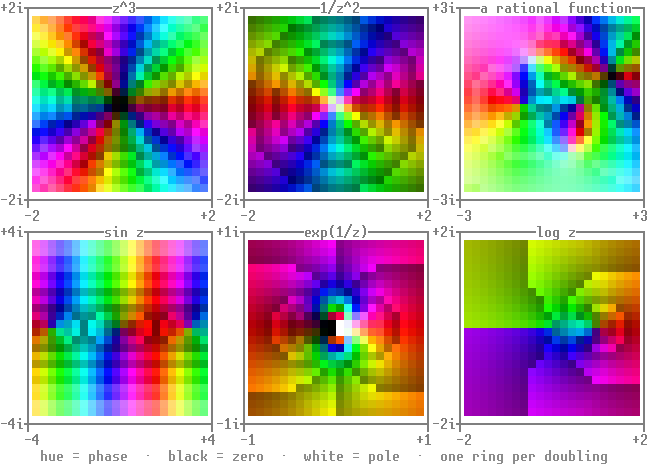
Domain colouring Six complex functions. Hue for phase and lightness for modulus. Zeros come out black and poles white. A dark ring marks every doubling. By Claude Opus 5. |
|
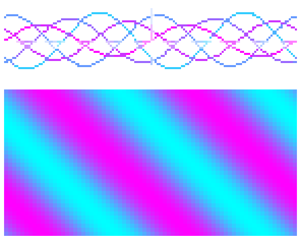
Functions Mathematical function visualisation with scatter and function2. By Matthew Farrugia-Roberts. |
|
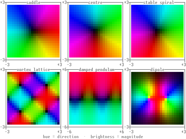
Phase portraits Six planar vector fields as colour fields. Hue for direction and brightness for magnitude. By Claude Opus 5. |
|
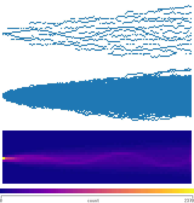
Time series histogram Time series visualisation with stacked scatter, pooled scatter, and 2D histogram. By Matthew Farrugia-Roberts. |
|
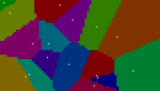
Voronoi diagram Voronoi diagram using function heatmaps and scipy. By Gemini 2.5 Pro. |
Bars and Columnsdocs
| Image | Example |
|---|---|
|
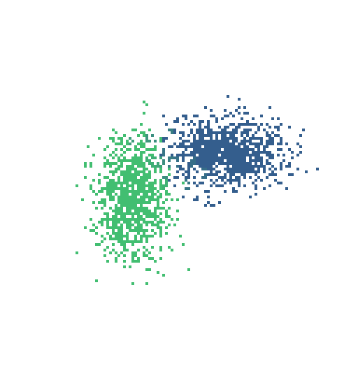
Joint distribution Joint distribution with marginal histograms, demonstrating plot composition with hstack and vstack. By Claude Opus 4.6. |
|
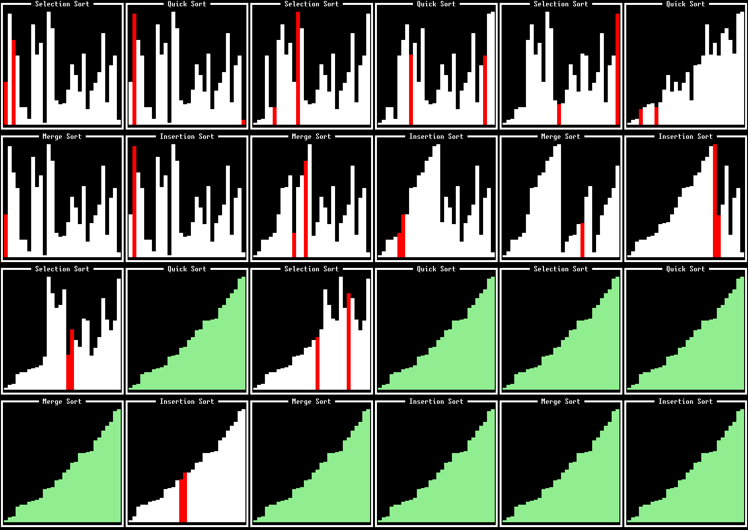
Sorting algorithms Various sorting algorithms racing in parallel, visualised with By Gemini 3.1 Pro. |
Boxes and Candlesdocs
| Image | Example |
|---|---|
|
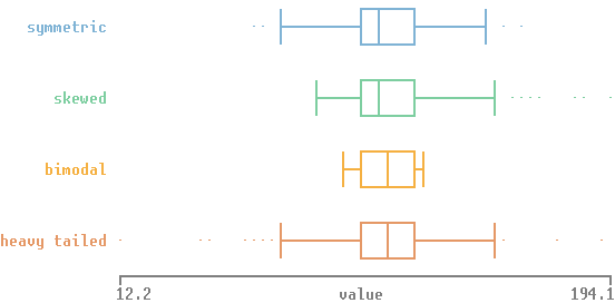
Box plots Four distributions with the same quartiles and different shapes. By Claude Opus 5. |
|
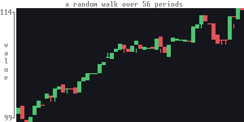
Candlesticks A simulated price series. By Claude Opus 5. |
Nonlinear Visualisationdocs
| Image | Example |
|---|---|
|
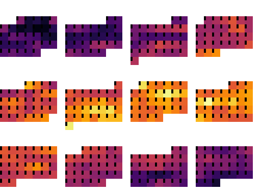
Calendar heatmap Calendar heatmap of daily maximum temperatures in Oxford, 2025. By Matthew Farrugia-Roberts and Claude Opus 4.6. |

|
Commit heatmap A year of commits to this repository as a strip of weeks. By Claude Opus 5. |
|
Hilbert curve Hilbert curve visualisation of binomial data. By Matthew Farrugia-Roberts. |
Mediadocs
| Image | Example |
|---|---|
|
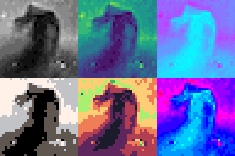
Image rendering Image rendering with various colormaps. By Matthew Farrugia-Roberts. |
Mapsdocs
| Image | Example |
|---|---|

|
Globe A spinning Earth based on projection inversion. Terrain, clouds, city lights, day-night, atmospheric halo. By Claude Opus 5. |
|
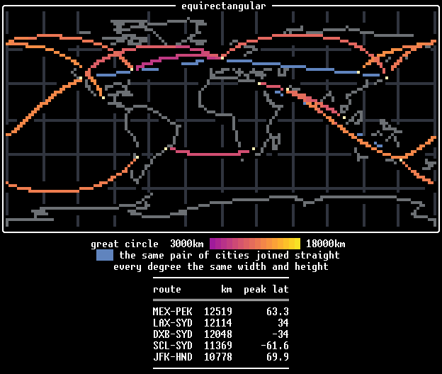
Great-circle routes Ten long-haul flight routes on a world map. Try one of five different projections! By Claude Opus 5. |
Retro Animationsdocs
| Image | Example |
|---|---|

|
Boing The Amiga Boing Ball, 1984, animated using a rotating colour palette. By Claude Opus 5. |

|
Doom fire The classic 1997 PSX Doom fire effect mapped through a custom palette using By Gemini 3.1 Pro. |
|
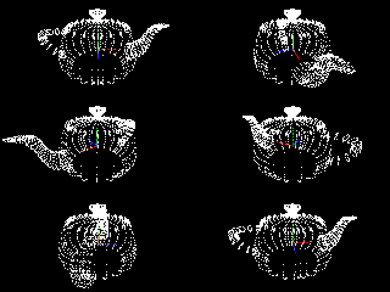
Teapot 3D scatter plot with animated camera orbit. By Matthew Farrugia-Roberts. |
|
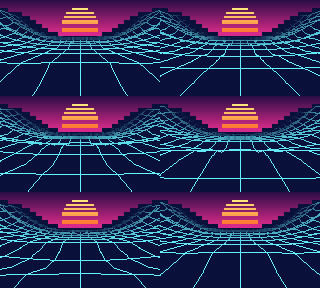
Vaporwave A wireframe landscape scrolling under a banded sun. The backdrop of
sky, ground and sun is an image of half-blocks; the terrain is one
By Matthew Farrugia-Roberts and Claude Opus 5. |
Simulationsdocs
| Image | Example |
|---|---|

|
Boids Boids Flocking Simulation. Simulates autonomous agents (boids) moving in 2D space based on simple rules. By Gemini 3.1 Pro. |
|
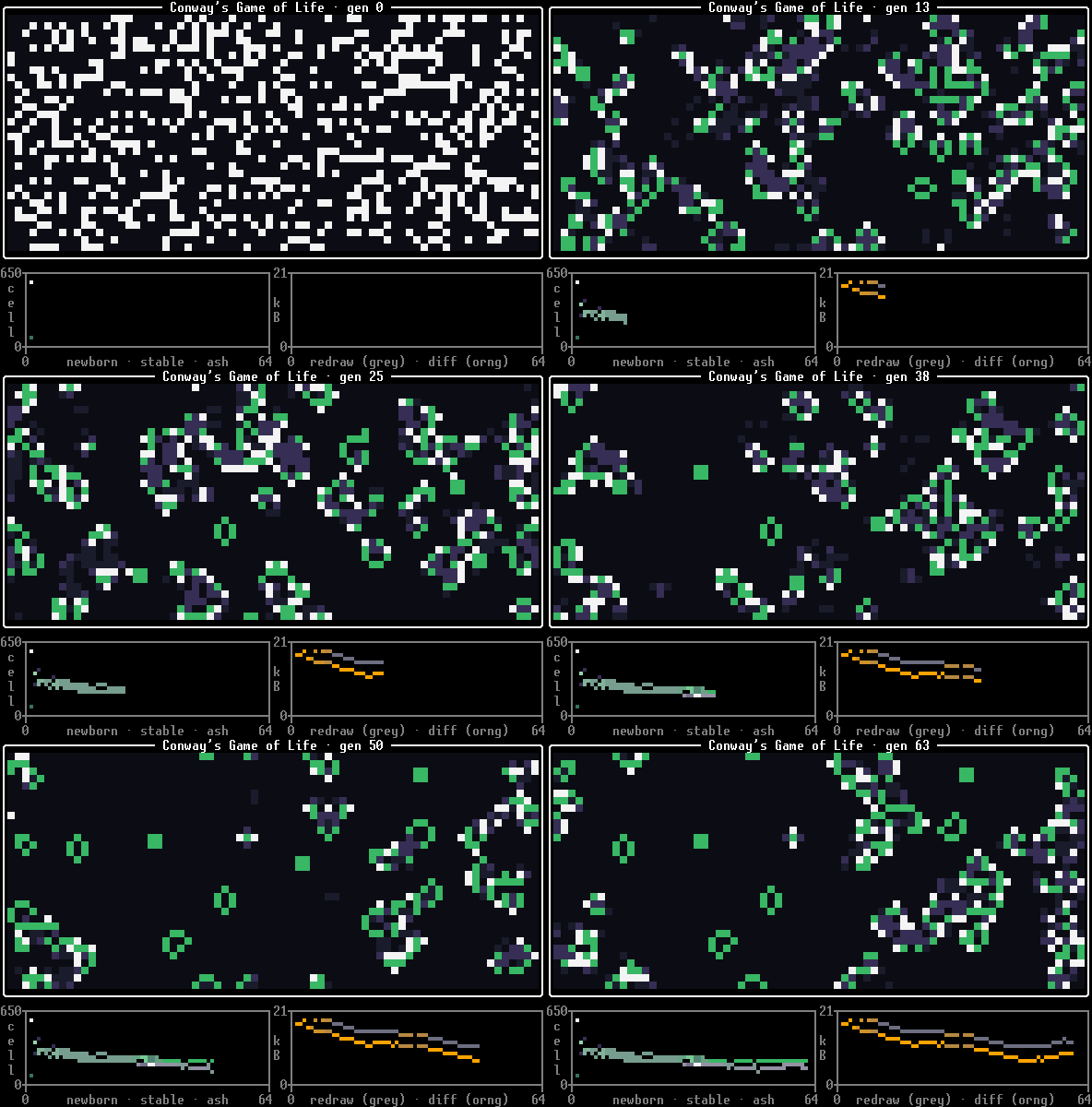
Life Conway's Game of Life with extra colours for newly alive/dead cells. The panels underneath track the cell counts and, on the right, number of terminal bytes written using different rendering methods. By Claude Opus 5. |
|
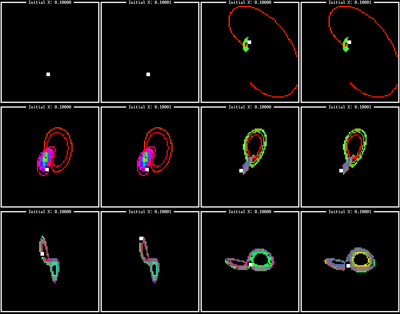
Lorenz attractor Animated 3D Lorenz attractors showing sensitive dependence on initial conditions. By Gemini 3.1 Pro. |

|
Mandelbrot Animated Mandelbrot fractal zoom using function heatmaps and colormaps. By Gemini 2.5 Pro. |
|
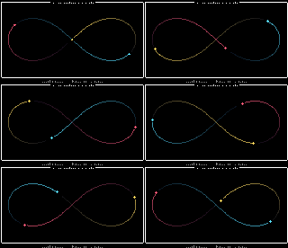
Three bodies Three equal masses chasing one another around a shared figure-eight orbit, integrated under Newtonian gravity. By GPT 5.6 Sol. |
Dashboards and UIdocs
| Image | Example |
|---|---|
|
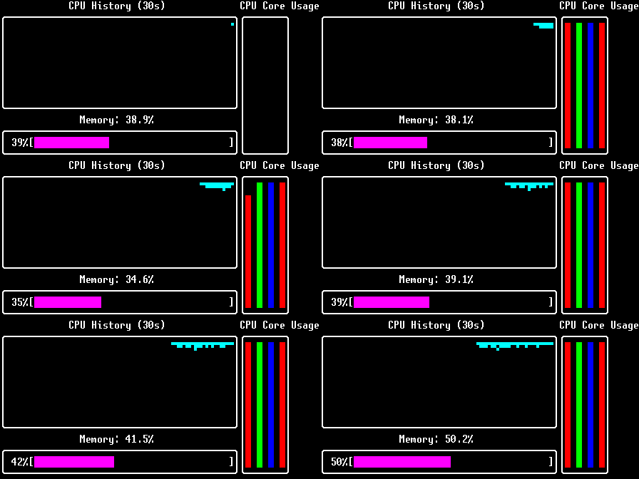
Dashboard Live system monitoring dashboard showing CPU and memory usage. By Gemini 2.5 Pro. |
|
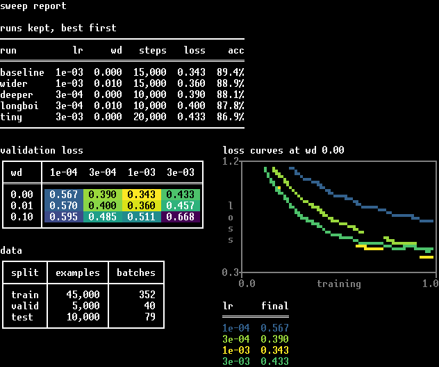
Sweep report A hyperparameter sweep reported in tables: runs ruled the way a paper rules a table, the sweep itself shaded by the losses it is showing, and a legend whose rows are coloured to match the curves beside them. By Claude Opus 5. |
Utilitiesdocs
| Image | Example |
|---|---|
|
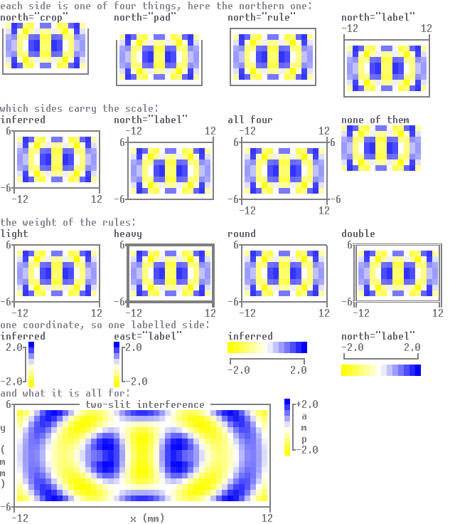
Axes gallery Axis configuration options: Side types, rule types. By Claude Opus 5. |
|
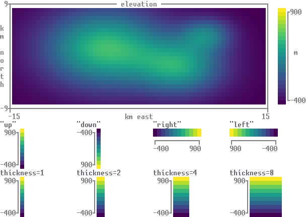
Colorbars An island's elevation with its scale beside it, then the same scale in four directions and four thicknesses. By Claude Opus 5. |
|
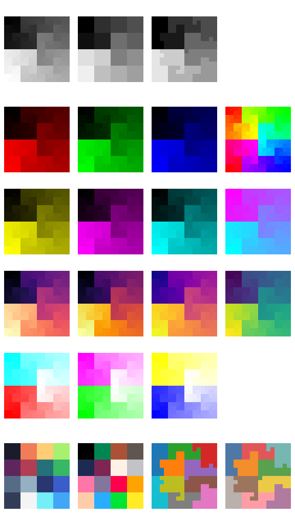
Colormaps Gallery of all available continuous and discrete colormaps. By Matthew Farrugia-Roberts. |
|
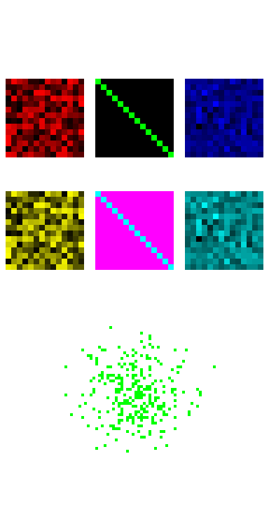
Demo Original library example combining images, borders, and scatter plots. By Matthew Farrugia-Roberts. |
Run python examples/terminal_test.py
|
Terminal test Does your terminal render matthewplotlib correctly? Test of escape sequences for colour, redrawing in place, resizing, and a plot pushed against the right margin. See also compatibility. By Claude Opus 5. |